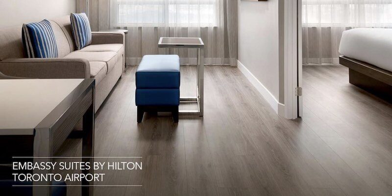


Only the first one is an actual homepage banner, but other two could easily be translated or transformed into one.
This minimalist design is the antithesis to the “maximalist” examples in my previous post, but no less impactful, in my opinion. In fact, the second image stopped me in my tracks! It’s stunningly simple.
I chose a minimalist approach for my own homepage because I wanted my design to reflect me and my message: frill-free and straightforward.

Founder of Spotlight Local SEO. I love websites, and I am passionate about helping local businesses grow and get found on Google. I have helped Austin companies create sleek, functional, mobile-friendly websites and achieve SEO success in competitive verticals like healthcare, B2B, insurance, retail, and more.
