If I open a promotional or marketing email, I’m skimming it. If it’s hard to read, I’ll probably stop reading it—especially if I’m on my phone.
The other day, this email stopped me mid-scroll:
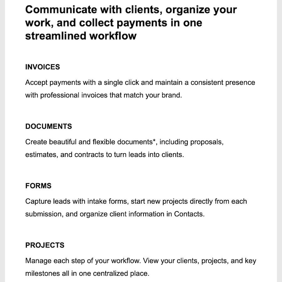
Kudos to Squarespace for their clean designs!
Isn’t it restful on the eyes? It’s spacious and calm. Doesn’t it make you feel like you can breathe? Good design has this effect on me. (Is it just me? 😆) I had an inkling about what made it easy to read and pleasing to the eyes, but I wanted to know, so I enlisted the help of Claude to analyze it. Btw, I don’t have a design background. I’ve learned a lot of design principles along the way, but I consider myself a student of design, so if I like something, I study it to figure out why.
Here are some key styling elements/ settings you can implement right away in your own emails:
Width
600px
FONT STYLE
They use Clarkson Medium and Clarkson BookProduct, which are proprietary to Squarespace. Here are some similar, common alternatives: Work Sans, Inter, Roboto, Arial, Calibri.
FONT SIZE
- H1: 36px, bold
- H2: 24px, bold
- H3: 16px, bold, uppercase
- Body/ Paragraph: 16px (never go below this)
- Body/ Paragraph line height: 28px
Notice the relationships or ratios between font sizes and font + line-spacing:
- Heading font sizes increase by 1.5x.
- Body/ paragraph line-spacing is 1.75x body/ paragraph font size.
PADDING
- Email body: top-bottom 60px; left-right 45px
- Heading (H1, H2, H3) font: 0px top; 10px bottom
- Body/ Paragraph font: 0px top; 45px bottom (or 45px between sections)
FONT COLOR
This is where I disagree with Squarespace a little bit. They use pure black #000000. Some will argue that black is too much contrast and very dark grays or dark blue-grays are actually easier on the eyes. Here are some alternatives to black:
| #0a0a0f – Near-black (blue hint) | Feel: Slightly warmer than pure black Best for: Professional docs, reports |
| #1a1a1a – Very dark gray | Feel: Softer, less harsh Best for: Long articles, blog posts |
| #1e293b – Slate-black (blue-gray) | Feel: Modern, gentle, sophisticated Best for: Modern websites, apps |
| #333333 – Dark gray | Feel: Comfortable, classic Best for: Extended reading |
| #353535 – Slightly lighter gray | Feel: Very gentle, minimal strain Best for: Light mode interfaces |
| #2b2d42 – Blue-black | Feel: Sophisticated, easy on eyes Best for: Design-forward sites |
Let me know what you try and what works!

Founder of Spotlight Local SEO. I love websites, and I am passionate about helping local businesses grow and get found on Google. I have helped Austin companies create sleek, functional, mobile-friendly websites and achieve SEO success in competitive verticals like healthcare, B2B, insurance, retail, and more.